Choosing bridal accessory metals and finishes that harmonize with venue decor and bouquet accents for cohesive wedding imagery and style.
Delve into how metallic accents can unify your wedding aesthetic, from jewelry to hairpieces, while aligning with venue tones and floral palettes. Learn practical pairings, contrast strategies, and timeless finish choices that elevate photography, texture, and overall mood without overwhelming the look.
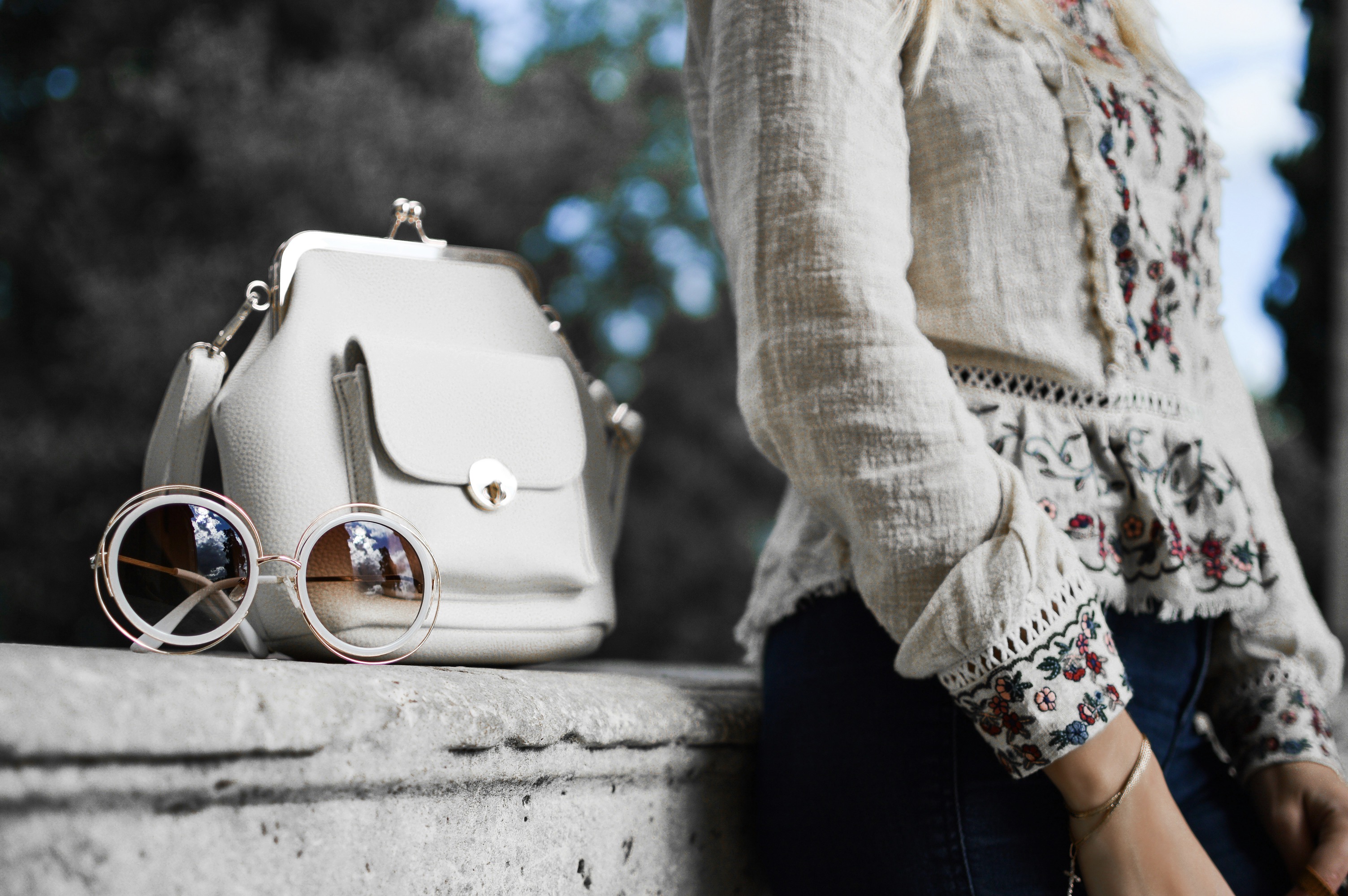
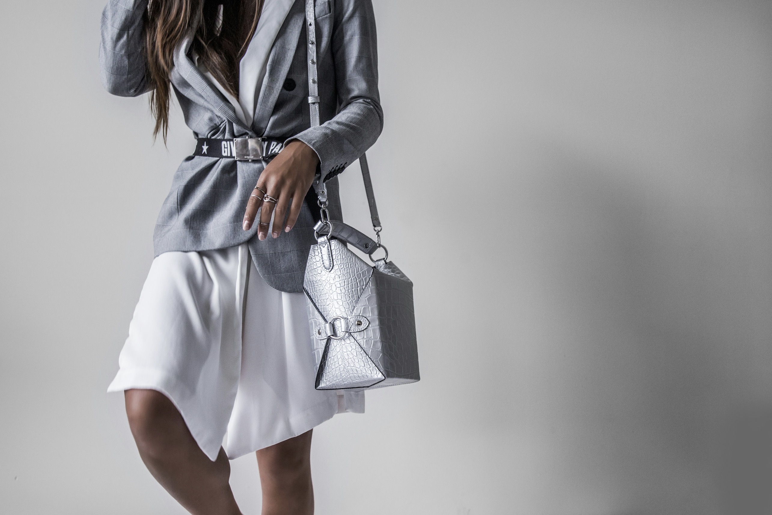
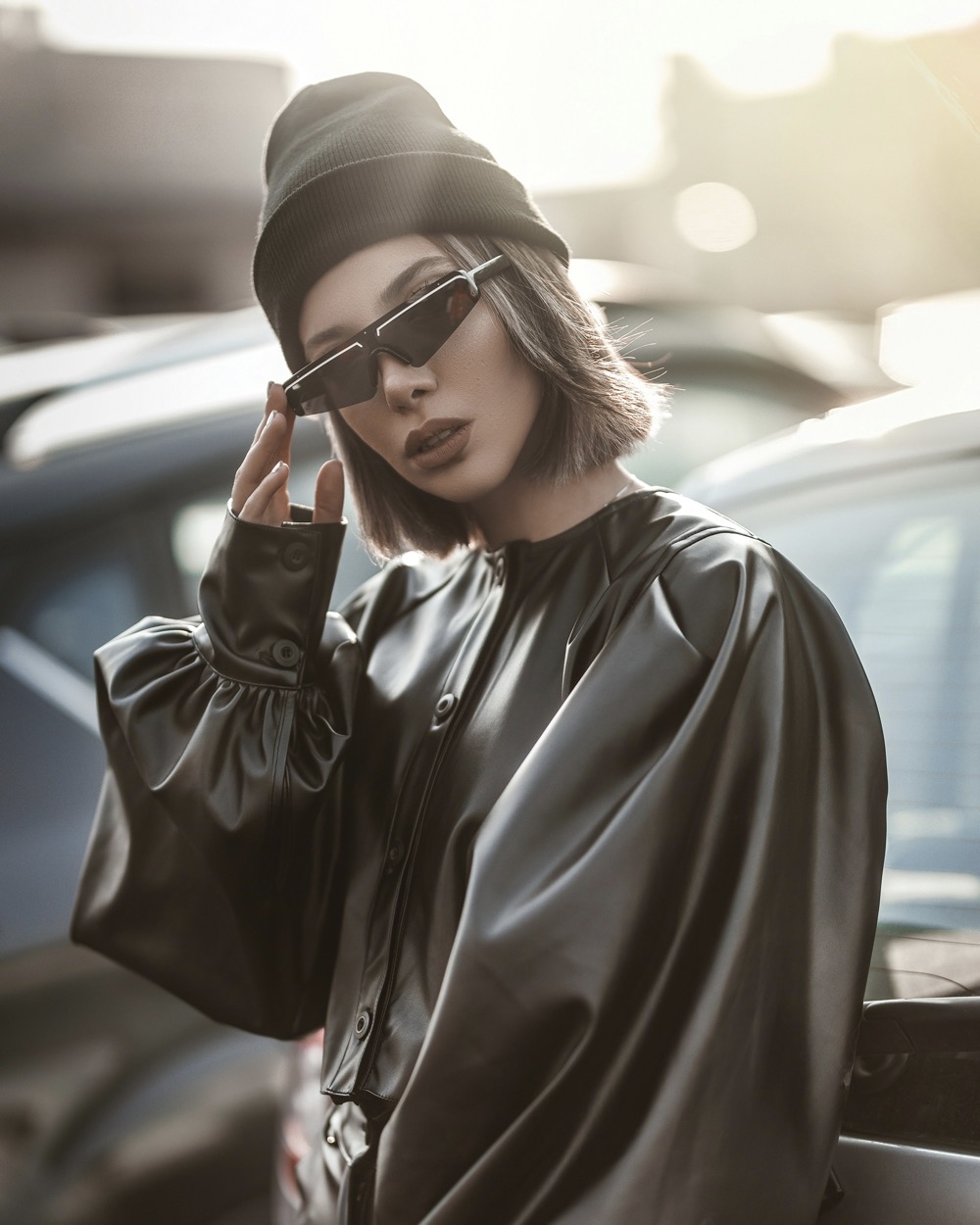
Jewelry and accessory metals set the first mood for your wedding ensemble, acting as a bridge between your dress, bouquet, and the architectural voice of the venue. The choice of gold, silver, rose gold, platinum, or alternatives like brass or titanium should reflect not only personal taste but the season, light conditions, and space design. A warmer metal pairs beautifully with candlelight and warm wood tones, while cooler tones harmonize with minimalistic, airy spaces and crystal-adorned décor. Consider how your bouquet’s metallic accents—stems, wraps, or foilage accents—will interact with your chosen metal to ensure harmony in every frame.
Begin by surveying the venue’s dominant colors and textures—stone walls, timber beams, lush tapestries, or gilded moldings—and map how metallic accents will sit within that palette. If the venue leans rustic, you might lean into warm golds or antique brass to echo vintage chair finishes or brass chandeliers. For modern venues with cool grays and stark whites, platinum or white gold can create a crisp, cohesive silhouette. Your bouquet can guide subtler choices: a cream ribbon versus a deep burgundy wrap, or tiny metal seed beads that reflect nearby lighting. The aim is to maintain a quiet continuity that your photographer will notice.
The bouquet and venue dictate the story your metals tell through light.
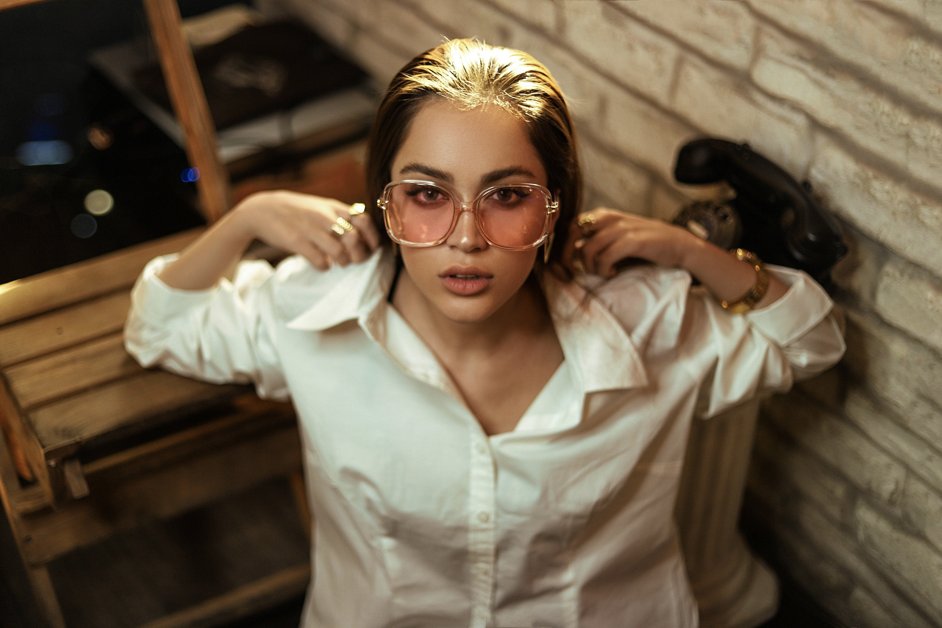
The texture of your metals matters as much as the color. Shiny, high-polish surfaces reflect light aggressively and stand out, whereas brushed, satin, or matte finishes soften the look and blend with ambient tones. If the venue features glossy surfaces, a satin or brushed finish on earrings or a bracelet prevents competing reflections. Conversely, a dash of high shine can be used sparingly to draw attention to a particular detail, such as a necklace pendant that echoes a centerpiece or a metallic thread in your veil. Test how several pieces photograph under the venue lighting to avoid glare or entry of unwanted color casts.
Take bouquet accents into account when choosing finishes. If your blooms feature velvety petals and deep hues, a warmer metallic touch like rose gold can highlight those tones without clashing with greens and creams. If the bouquet uses pale, airy flowers, cooler metals—white gold or platinum—can preserve the ethereal feel. Consider metallic trims in the bouquet wrap or a small metallic pin that nods to your earrings or hair comb. The goal is a curated cadence: every metallic note should echo another, not compete, so the imagery remains calm and cohesive in every shot.
Dress intensity and lighting should guide your metal choices with care.
When planning, create a metal palette that aligns with the season and lighting of your ceremony. In autumn weddings, coppery hues and antique brass can harmonize with amber light and wooden pews; in winter, silvery tones reflect cool air and crystal ornaments. Spring colors invite warmer, soft golds, while summer favors bright, almost luminous gold and pearl nuances. A practical approach is to choose one dominant metal for most accessories and allow small complementary flecks to appear in the bouquet, shoes, and hairpieces. This restrained approach ensures you avoid competing metal statements while still delivering a polished, magazine-worthy aesthetic.
Consider the style of your dress as you pair finishes. A sleek satin gown benefits from minimalist metals—thin, simple earrings in white gold or platinum—so the dress remains the center of attention. A lace or embroidered gown can tolerate more ornate pieces; filigree, milgrain, or etched designs in antiqued gold can echo the gown’s motifs. If your gown has metallic thread or beading, mirror those accents in a subdued way through a bracelet or comb rather than wearing a full set of matching pieces. The idea is to weave a story without repeating a single sentence of the wardrobe’s identity.
Subtlety and balance keep metallic accents elegant and timeless.
The lighting plan for your ceremony and reception plays a crucial role in how metals read on camera. Warm candlelight softens metallic surfaces, making rose gold appear more peach and gold look cozier. Cool LED or daylight-balanced lamps elevate platinum to a crisp, almost icy gleam. Photographers can help you balance this by shooting test portraits at the venue with your chosen metals visible against the backdrop. If you anticipate mixed lighting, leaning toward a mid-toned metal—like a balanced white gold—can preserve detail while preventing color shifts in photos. A thoughtful pre-shoot check minimizes surprises on the wedding day.
In addition to jewelry, explore finishing choices for optional accessories such as hair pins, combs, or a delicate belt. Hair pieces in antique brass or champagne gold can feel vintage and romantic in castles or botanical venues, while a sculpted silver comb can feel sleek in contemporary loft spaces. Matching the finish of your hair piece to your earrings and bracelet creates a visual line that guides the eye along your silhouette. For bouquets with metallic accents in the stems or ribbons, a small, almost invisible connector piece can subtly harmonize with your ensemble without becoming a focal point.
Final harmony comes from thoughtful testing and timelessness.
Tasteful repetition across your accessories is key to cohesion. Choose a primary metal for the largest items—earrings or a pendant—and rotate a secondary finish in smaller accents like a clutch clasp, a shoe buckle, or a hairpiece. The secondary finish should echo the bouquet or decor but remain restrained, avoiding a matchy-matchy effect that can look forced. When in doubt, select three tones at most and distribute them across different articles to maintain a quiet, well-curated rhythm. The elegance of a cohesive look lies in restraint as much as in choice.
Consider sentimental metals to add personal resonance without overwhelming the aesthetic. If a family heirloom—say, a bracelet or pocket watch—offers a warm gold or rose tone, integrate it as a focal point rather than a bulk accessory. The emotional weight often translates beautifully in photos, especially when balanced with modern pieces that keep the styling current. Always ensure the heirloom is comfortable and appropriate for the moment, as you will wear it for hours and want it to enhance, not obstruct, your day. Think of the total imagery as a family tree rendered through light and metal.
Build a small, deliberate “metal mood board” for your planning conversations with designers. Include fabric swatches, swatches of bouquet ribbons, and photos of the venue’s textures to visualize how the chosen metals will interact in different lighting conditions. Share a few inspirational images to convey your preferred finish—whether a warm antique look or a cool contemporary gleam—so the jeweler and stylist can align on a cohesive palette. This approach reduces last-minute friction and ensures every accessory adds to the scene rather than competing with it. The board becomes a practical, evolving guide during fittings.
Finally, remember that the most memorable weddings are those where every detail supports a unified narrative. Metals should feel inevitable, not chosen for trend's sake, and finishes should echo the atmosphere you cultivate through flowers, fabric, and architecture. Your images will reflect a consistent mood: warmth or clarity, softness or structure, depending on how deftly you balance metal, texture, and light. When guests look back, they should sense a deliberate harmony that makes the entire event feel cohesive, timeless, and unmistakably yours. Embrace experimentation in small doses, but prioritize enduring elegance above all.